Intro
Fontfabric · Svetoslav Simov · 2012
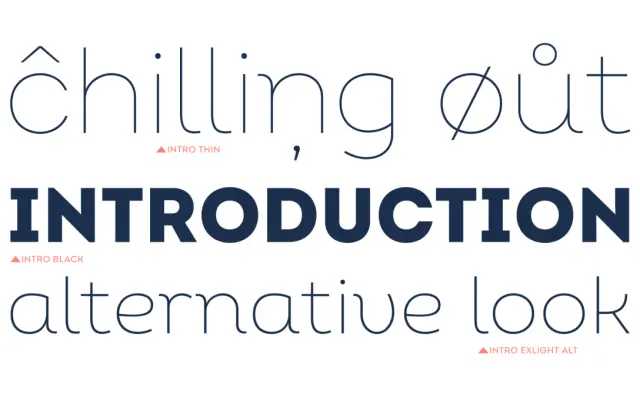
A geometric sans from Fontfabric spanning 72 styles across standard and condensed widths, with inline and alternate variants for editorial and branding work.
About
Designed by Svetoslav Simov and released in 2012, Intro draws its structure from Futura, Avant Garde and DIN, combining pure geometric forms with humanist inflections that are most visible in the flowing italics. The family runs from Thin to Black in both standard and condensed widths, with obliques, true italics, alternate characters and inline cuts at the heavy end. Extended Latin and Cyrillic coverage alongside OpenType features including small caps, old-style figures and case-sensitive forms make it a practical workhorse across editorial, packaging, UI and motion graphics.
Classification
Directly inspired by early 20th-century geometric sans-serif forms, drawing on Futura, Avant Garde and DIN, with triangles, circles and squares as its structural basis and humanist details softening the italics.