Rizo
Fontfabric · Vika Usmanova, Ivelina Martinova · 2026
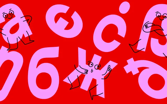
A reverse-contrast display sans built on a neo-grotesque skeleton, offered across five widths from Regular to Compressed with a variable font covering weight and width axes.
About
Rizo takes its cue from the accidental reverse contrast that occurs when designers manually compress type by hand, and formalises that effect into a disciplined family of ten styles. Horizontal strokes read heavier than verticals throughout, giving the typeface a distinctive visual tension that suits headlines, packaging and branding. Extended Latin and Cyrillic coverage, plus OpenType features including discretionary ligatures for capitals and Bulgarian localisation, broaden its practical reach.
Classification
Rizo is a display typeface built on a neo-grotesque foundation with deliberate reverse contrast, where horizontal strokes outweigh vertical ones. This expressive structural inversion and compressed proportions place it firmly in the display category rather than functional sans-serif.