Boska
Fontshare · Barbara Bigosinska · 2021
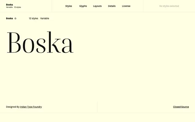
A Didone display family by Barbara Bigosinska with high stroke contrast, calligraphic inflection and slightly condensed proportions, designed for editorial headlines and signage.
About
Drawn with the high stroke contrast of nineteenth-century modern serifs and the rhythm of pointed-pen calligraphy, Boska offers six weights from Extralight to Black, each with a matching italic. The characters sit slightly condensed, especially in the uppercase, while lowercase ascenders clear the cap height; default oldstyle figures and small caps are included, with lining figures accessible via OpenType. Special glyphs such as the hashtag and @ are rendered in hairline monolinear strokes so they recede behind the alphabetic characters.
Classification
Fontshare categorises Boska as Serif, Display. It is a high-contrast Didone-style family with calligraphic influences, intended primarily for large-scale headline and editorial use rather than text setting.