Britney
Fontshare · Indian Type Foundry · 2021
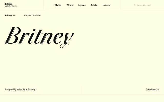
A high-contrast display family from Indian Type Foundry that borrows pointed-brush forms without the roughness, keeping stems clean and doubled for a distinctive graphic effect.
About
Four weights from Light to Ultra, plus a variable axis, give the family a wide tonal range while maintaining its characteristic double-stroke stems and sharp contrast. Capital letters are deliberately restrained, avoiding loops and flourishes so all-caps settings remain legible. Suited to packaging, album covers, magazine headlines and anywhere a small number of characters needs to carry strong visual presence.
Classification
Fontshare classifies it as Script, but ITF describe it as living on the border between sans serif, cursive and script. Its very high contrast, double stem strokes and clean pointed-brush shapes place it firmly in the display category rather than a functional script.