Clash Display
Fontshare · Indian Type Foundry · 2021
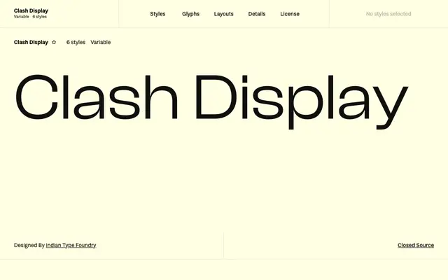
A neo-grotesque display family from Indian Type Foundry distinguished by unusually tight apertures and pronounced stroke contrast at heavier weights.
About
Six weights from Extralight to Bold, plus a variable font, make up this display-oriented sans designed for use at large sizes. Its defining characteristic is near-closed apertures on letters like the 'c', combined with increasing stroke contrast as weights grow heavier, giving bolder cuts a noticeably pinched quality at stroke junctions. Despite its expressive details, the family is restrained enough for corporate identity work alongside editorial and banner applications.
Classification
A neo-grotesque sans with tight apertures and notable stroke contrast, designed specifically for large display sizes rather than text use, placing it firmly in the display category despite its grotesque structural roots.