Erode
Fontshare · Nikhil Ranganathan, Indian Type Foundry · 2015
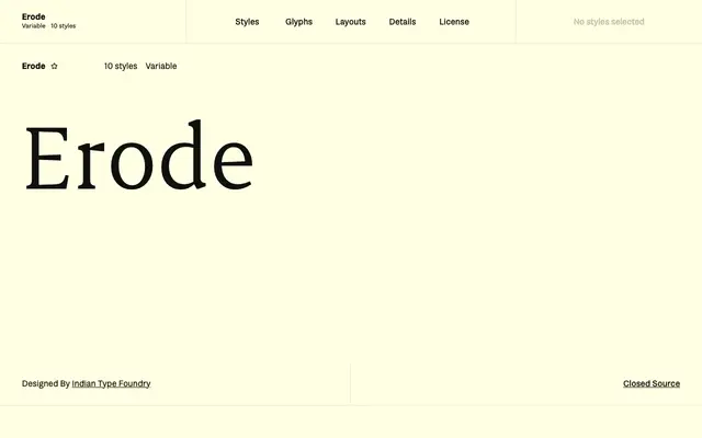
A high-contrast Latin serif from the Indian Type Foundry, designed for display use with long ascenders and open counters across five weights.
About
Named after a city in Tamil Nadu and developed in 2015 by Nikhil Ranganathan and ITF, Erode offers clear stroke contrast and generous ascenders that make it well suited to pull quotes, headlines and poster work. The family spans five weights from Light to Bold, each with a matching italic, plus variable font axes for weight. With 135 languages supported across extended Latin script, it covers broad editorial use cases for display-size settings.
Classification
Fontshare categorises Erode as Serif with display characteristics; the typeface features clear stroke contrast, long ascenders and open counters, positioning it firmly as a high-contrast display serif suited to headlines and pull quotes rather than continuous text.