Gambetta
Fontshare · Paul Troppmar · 2021
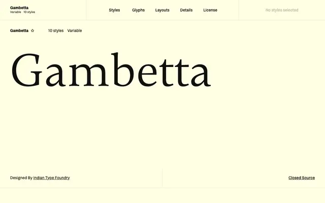
A text serif by Paul Troppmar with diagonal stress, increasing stroke contrast across five weights, and distinctive wedge-shaped terminals throughout the uppercase.
About
Designed for book and editorial settings, Gambetta offers ten styles across five weights from Light to Bold, each with an accompanying italic. The upright cuts feature wedge terminals on all uppercase vertical strokes, while open counterforms on the lowercase 'a' improve readability at text sizes. In the italics, the single-storey 'a' and double-storey 'g' with its prominent diagonal ear give the family a lively secondary texture.
Classification
Gambetta features diagonal stress, visible stroke contrast that increases with weight, and prominent wedge-shaped terminals — hallmarks of a transitional serif tradition, designed explicitly for continuous text setting.