Hoover
Fontshare · Gaetan Baehr · 2021
slabmonolinear slab
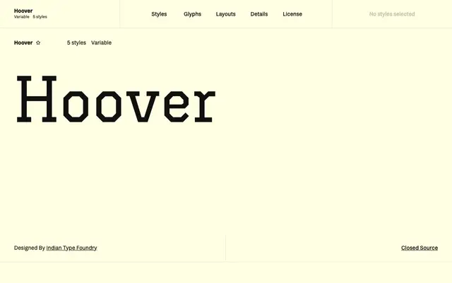
A monolinear slab serif by Gaetan Baehr built entirely from straight strokes, with no curves anywhere in its letterforms.
About
Every character in Hoover is constructed from horizontal, vertical and diagonal lines only, eliminating all curved or rounded forms from the alphabet. The result immediately reads as collegiate or athletic, recalling over a century of Anglo-American sports graphics. Five static weights from Thin to Bold are available alongside a variable font, with coverage for 135 Latin-script languages.
Classification
Fontshare categorises Hoover as Slab; its letterforms are built entirely from straight strokes with no curves, making it a geometric, monolinear slab serif with a distinctly collegiate character.
Weights
ThinLightRegularMediumBold
Languages
Latin Extended
Tags
slabmonolineargeometriccollegiateangularsportspostereditorial