Karma
Fontshare · Joana Correia · 2014
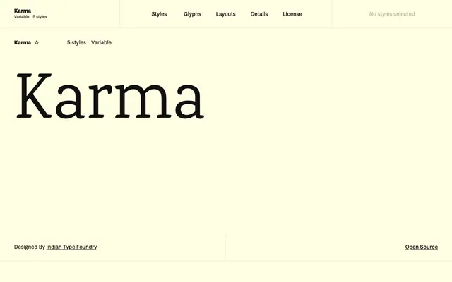
A screen-oriented serif by Joana Correia for Indian Type Foundry, built around monolinear construction, a tall x-height and economical character widths.
About
Designed by Joana Correia and first published by Indian Type Foundry in 2014, Karma was conceived specifically for body text on screen. Its characters tend toward the monolinear and are kept narrow, with a tall x-height that aids legibility at small sizes. Five static weights from Light to Bold are available alongside a variable font, and the family is released under the SIL Open Font License.
Classification
Karma tends toward the monolinear in construction with a tall x-height and economic character widths, placing it closer to humanist serif territory designed primarily for screen body text legibility.