Khand
Fontshare · Satya Rajpurohit · 2014
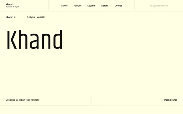
A compact, modular mono-linear sans designed for display and headline use, built with open counters and shortened vowel marks to allow tight line-setting.
About
Designed by Satya Rajpurohit at Indian Type Foundry and first published in 2014, Khand uses a modular construction in which letterforms share strong formal commonality without becoming repetitive. The base character height runs large on the body, with vowel marks deliberately abbreviated to permit close vertical spacing in headline settings. Five weights from Light to Bold cover both short text paragraphs and single-word display applications, and a variable font is also available.
Classification
Khand is described as a mono-linear sans built on a modular system with open counter forms, placing it firmly in the geometric sans tradition. Its compact, display-optimised proportions distinguish it from humanist or grotesque classifications.