Neco
Fontshare · Jitka Janečková · 2021
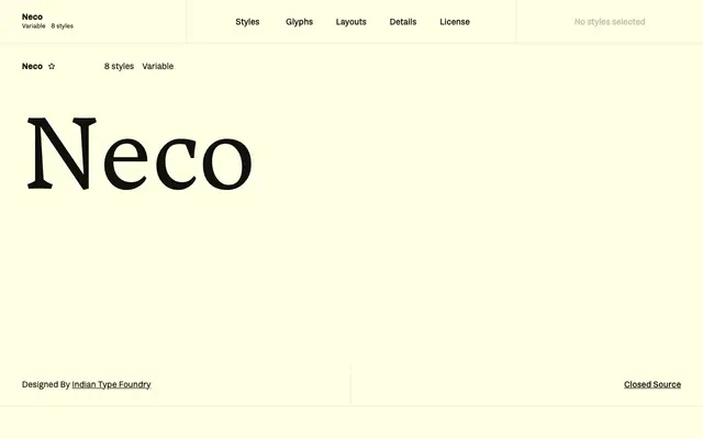
A serif family by Jitka Janečková with wedge-shaped serifs, high stroke contrast and true cursive italics, suited to editorial and headline work.
About
Designed by Jitka Janečková and released on Fontshare in 2021, Neco spans four weights from Regular to Black, each with a matching italic drawn as true cursive forms rather than sloped uprights. The wedge-shaped serifs and diagonal stress axis give it a distinctive tension that intensifies markedly at heavier weights, making the Black particularly forceful. Proportional oldstyle figures are the default, with tabular, lining and small-cap numerals also included, alongside f-ligatures and full fraction support.
Classification
Neco features prominent wedge-shaped serifs, a diagonal axis of stress and high stroke contrast, placing it in the wedge or Latin serif tradition rather than classical old-style or transitional categories.