New Title
Fontshare · Indian Type Foundry · 2022
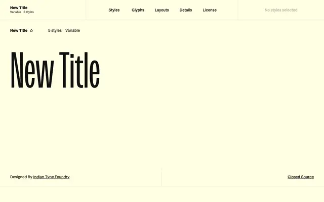
A narrow, near-monolinear display sans designed by Indian Type Foundry for film title sequences and credits work.
About
Built around compressed letterforms with almost monolinear strokes, New Title suits the precise, utilitarian demands of screen titles and credits sequences. Distinctive details include a capital J whose out-stroke doesn't descend, two forms of the lowercase g, and currency symbols with a gap through their main strokes. The family runs across five static weights from Extralight to Bold, plus a variable font, covering 135 languages across Latin Extended.
Classification
Fontshare categorises it as Sans and Display; the narrow, near-monolinear letterforms and utilitarian character make it a compressed display sans aimed at titling contexts rather than body text.