Plus Jakarta Sans
Fontshare · Gumpita Rahayu / Tokotype · 2020
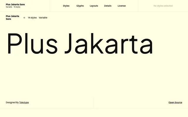
A geometric sans-serif originally commissioned for the Jakarta Provincial Government's +Jakarta City of Collaboration identity in 2020, later released as an open-source family.
About
Designed by Gumpita Rahayu at Tokotype, it draws on Neuzeit Grotesk, Futura and 1930s grotesque sans-serifs, with near-monoline contrast and a slightly taller x-height for legibility across sizes. Three stylistic alternates, named Lancip (Sharp), Lurus (Straight) and Lingkar (Swirl), give individual glyphs distinctive character. The family spans seven weights with matching italics and includes variable font files for both weight and italic axes.
Classification
Described as a geometric sans-serif drawing on Neuzeit Grotesk, Futura and 1930s grotesque references, with near-monoline contrast and pointy curves characteristic of the geometric tradition.