Quilon
Fontshare · Indian Type Foundry · 2021
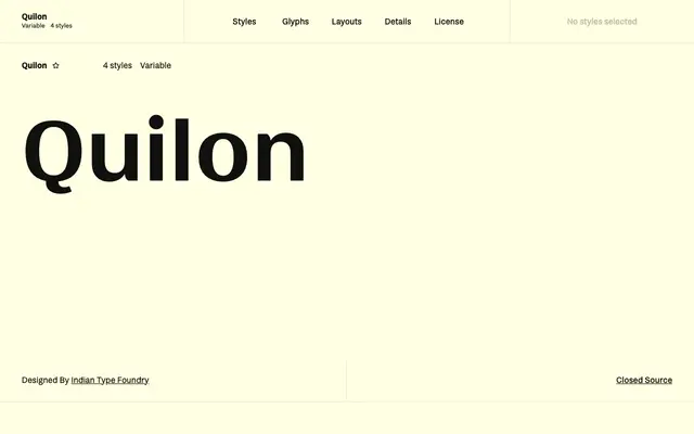
A high-contrast display sans from Indian Type Foundry, blending 19th century English grotesque structure with postmodern stroke drama across four weights.
About
Stroke contrast increases markedly as the weights progress from Regular to Bold, making the heavier cuts particularly suited to poster and headline work. Its letterforms reference both Victorian-era grotesques and 1990s postmodernism, giving the family an unusual dual lineage. Named after Quilon, the historical name for Kollam in Kerala, India, the family supports 135 languages across Latin Extended script coverage and ships with a variable font axis.
Classification
Described as a high-contrast sans serif drawing on 19th century English grotesques and 1990s postmodernism; the dramatic stroke contrast across weights pushes it toward display grotesque territory.