Ranade
Fontshare · Easha Ranade · 2021
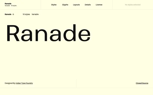
A neo-grotesque sans by Easha Ranade at Indian Type Foundry, distinguished by stark diagonal contrast borrowed from classic serif construction.
About
Ranade spans five weights from Thin to Bold, each with an upright and an oblique italic, and is also available as a variable font. Its tall x-height and compact spacing suit editorial and branding work, while the decision to keep 'J' and 'Q' within cap-height makes it unusually tidy at tight leading. The diagonal stroke contrast gives it more character than a typical workhorse neo-grotesque, though it remains restrained enough for corporate use.
Classification
Fontshare categorises Ranade as a sans serif in the neo-grotesk style; its defining feature is stark diagonal contrast, unusual for the genre, where thin strokes on diagonals echo classic serif construction.