Red Hat Display
Fontshare · Jeremy Mickel, MCKL · 2022
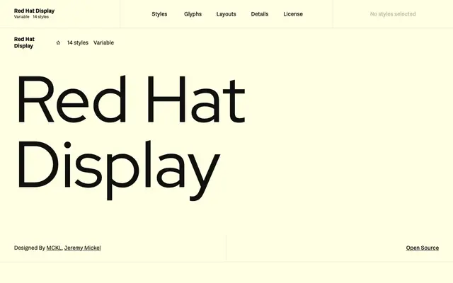
Originally commissioned by Paula Scher of Pentagram, this geometric sans was designed for Red Hat's corporate identity and optimised for headlines and large-scale use.
About
Designed by Jeremy Mickel of MCKL, Red Hat Display draws from American sans serifs such as Tempo and Highway Gothic, resulting in a low-contrast geometric with a large x-height and tight spacing suited to headlines. It forms part of a wider superfamily alongside Text and Mono styles, with the Display cut distinguished by its open counters and close-set characters. Available in seven weights with matching italics and variable font support, it is released under the SIL Open Font License.
Classification
Described explicitly as a geometric sans taking inspiration from American sans serifs including Tempo and Highway Gothic, with low contrast, large x-height and open counters optimised for display use.