Teko
Fontshare · Manushi Parikh · 2016
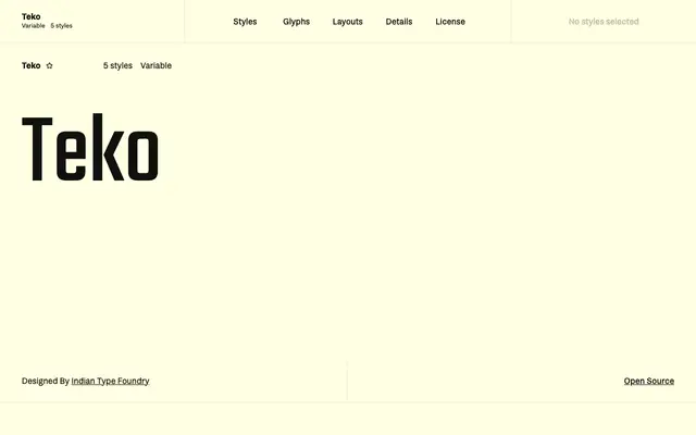
An open-source display sans by Manushi Parikh at the Indian Type Foundry, built for large-scale headlines with low stroke contrast and square proportions.
About
Designed at the Indian Type Foundry and first published in 2016, Teko targets headlines, news tickers and advertising copy where legibility at large sizes matters more than text performance. Its letterforms carry low stroke contrast and a visually simple, squarish structure that reads cleanly on screen. Light through Bold weights give flexibility across headline hierarchies, with the variable font covering the full range in a single file.
Classification
Teko is a display-oriented sans-serif with low stroke contrast and square proportions, designed explicitly for headlines and large-scale screen text rather than body copy.