seriftext serifitalic
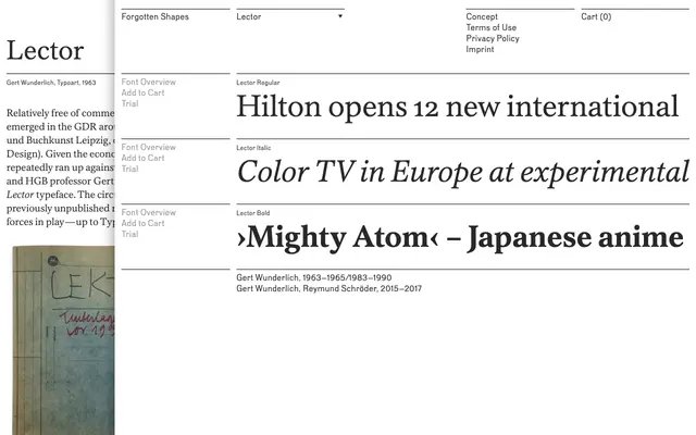
A text serif from Forgotten Shapes built around legibility and reading comfort, with its name drawn from the Latin word for reader.
About
Lector is a text-oriented serif from Berlin-based Forgotten Shapes, its name signalling a clear focus on sustained reading. The family includes OpenType features and broad language support within the Latin script, suggesting careful attention to typographic utility. It fits naturally in book, editorial and long-form setting where a dependable, characterful text face is needed.
Classification
The name and foundry context suggest a reading-oriented serif; classified as a text serif based on the family name 'Lector' (Latin for reader) and Forgotten Shapes' focus on refined, functional typefaces.
Weights
RegularBold
Languages
Latin
Tags
seriftextreadingbookeditorialclassical