Insitu
Formagari · Emmanuel Besse, Lucas Le Bihan · 2022
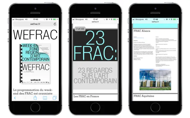
A neo-grotesque drawn initially for the ISELP art institute in Brussels, with tight spacing and visible contrast that suits large-scale display settings.
About
Developed first for a Brussels art institution and then refined for a French contemporary art funds event, Insitu takes cues from early 20th-century gothic letterforms and references like Folio. The tight spacing and sturdy construction make it well suited to lapidary conceptual art captions and heavy magazine headlines, though it holds together at text sizes when needed. Eight styles across four weights, each with matching italics, give it enough range for cultural publishing and institutional identity work.
Classification
The designers explicitly describe Insitu as a neo-grotesque inspired by early 20th-century gothics and classics like Folio, placing it firmly in that tradition with tight spacing and moderate contrast.