Malamocco
Formagari · Emmanuel Besse · 2022
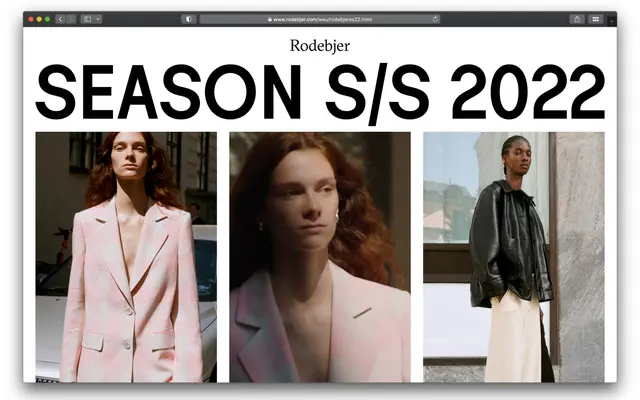
A sans serif drawn from the ad-hoc lettering of Venetian street signs, with deliberate formal inconsistencies and a low x-height that gives it quiet elegance at text sizes.
About
Emmanuel Besse looked to the idiosyncratic hand-painted signs of Venice and beyond for a typeface that trades perfection for character. The low x-height and loose spacing make it feel at ease in small-scale editorial settings as much as in bold display use, and the seven weights from Thin to Black give it enough range for fashion, art publishing and children's books alike. Its 702-glyph set covers extended Latin including Vietnamese, with lining and tabular figures, fractions, superiors and circled numbers.
Classification
Drawn from Venetian street sign vernacular, with deliberate inconsistencies and informal letterform shortcuts that place it firmly in the humanist sans tradition, far from geometric or grotesque rigour.