Rillus
Formagari · Emmanuel Besse · 2023
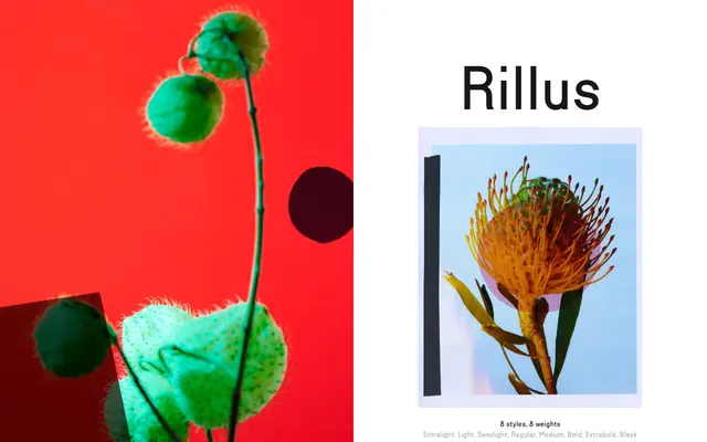
A geometric sans rooted in a 1936 Swiss lettering, with idiosyncratic details and a monolinear tone that grows increasingly display-oriented at heavier weights.
About
Designed by Emmanuel Besse and released in 2023, Rillus draws on a mid-century Swiss lettering source while nodding to Futura, Avant Garde and photo-lettering Bauhaus faces. Its monolinear strokes and closed-dot letterforms on the 'i', 'g' and 's' give it a distinctive character that sits between the warmth of 1970s conceptual graphics and the clarity of Swiss modernism. Eight weights run from Extralight to Black, with OpenType alternates for 'g', 'r' and 's' offering further typographic control.
Classification
Rillus is explicitly described as a geometric sans-serif, rooted in a 1936 Swiss lettering and drawing comparisons to Futura and Avant Garde, with a monolinear stroke and circular forms throughout.