Sancy
Formagari · Emmanuel Besse · 2025
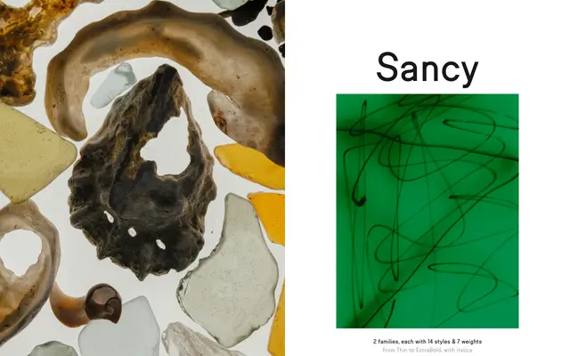
A semi-condensed grotesque and matching slab, both rooted in historical street signage and 19th-century French type specimens, designed by Emmanuel Besse in 2025.
About
Sancy originates from a wooden panel in the town of Besse, France, which gave the designer both the typeface's name and its starting letterforms. The collection pairs a narrow grotesque with a low-contrast slab drawn from sources including Antique No. 1 by Miller & Richard, the Peignot Égyptiennes and various Clarendon Condenseds, while the sans reaches towards stretched Helvetica derivatives and Parisian restaurant lightboxes. Each family spans seven weights from Thin to ExtraBold with matching italics, totalling 28 styles across the two subfamilies.
Classification
Sancy Sans is described explicitly as a narrow grotesque with low contrast and semi-condensed proportions, drawing from early French Antiques and semi-condensed grotesques. Sancy Slab shares the same narrow proportions and low contrast, classified as a companion slab variant.