Yet Grotesk
Formagari · Emmanuel Besse · 2025
sans-serifgrotesqueitalic
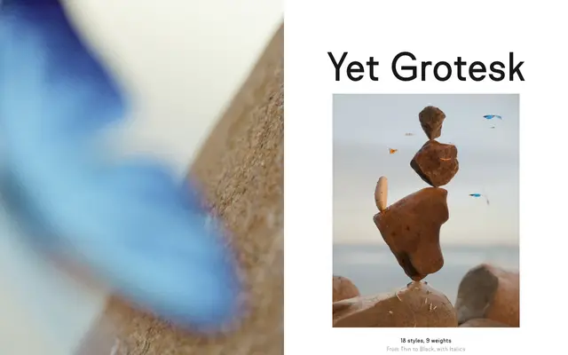
A nine-weight grotesk by Emmanuel Besse, drawing on Akzidenz Grotesk and Record Gothic with wide capitals and tight spacing suited to text and titling alike.
About
Released in 2025 under Formagari, Yet Grotesk spans eighteen styles from Thin to Black with matching italics. The design takes cues from Akzidenz Grotesk, Record Gothic and Gerstner Program, whilst acknowledging more accessible everyday forms like Arial. Wide capitals support strong all-caps settings, and spacing runs tight to produce dense, even text blocks.
Classification
A straightforwardly named grotesk in the tradition of Akzidenz Grotesk and Record Gothic, with wide capitals and tight spacing typical of the genre.
Weights
ThinExtraLightLightSemiLightRegularMediumBoldExtraBoldBlack
Languages
Latin Extended
Tags
grotesquebrandingfunctionalneutralworkhorsewide-capitalseditorial