Cambridge
Fort Foundry · Jen Hood
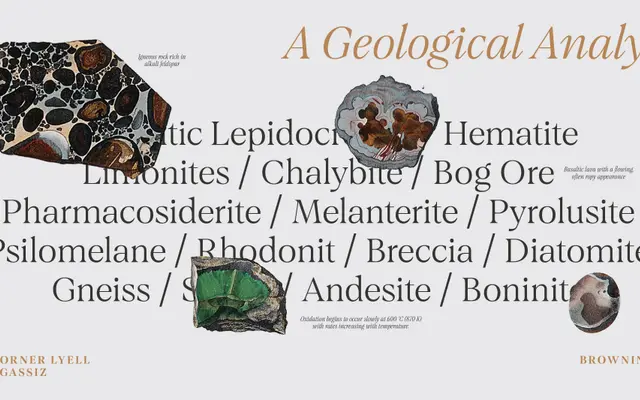
A classical serif in 20 styles drawing on the engraved headstones and bronze plaques of Boston and Cambridge, Massachusetts.
About
Designed by Jen Hood, Cambridge runs across two widths, standard and condensed, each with five weights from Light to Bold and matching italics. Its inspiration comes from the engraved stonework and institutional signage of the Boston area, lending the family a controlled, heritage character suited to editorial, academic and branding work where restraint is required. The extended Latin glyph set provides broad Western European language coverage.
Classification
The foundry describes it as elevated and timeless, drawing from engraved headstones and bronze institutional plaques, placing it firmly in the classical serif tradition with controlled stroke contrast and an academic character.