Colt
Fort Foundry · Mattox Shuler
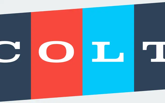
A wide Clarendon-style slab serif by Mattox Shuler, drawing on 1960s vehicle lettering with distinctive ball terminals across six weights.
About
Colt is an extended slab serif with letterforms rooted in the wide, muscular proportions found on American cars of the 1960s. Ball terminals anchor the design and tie it to the Clarendon genre, while the family comes in two sub-families, Colt and the softer-edged Colt Soft, each spanning six weights from Light to Black. Broad Latin language support and OpenType features including fractions and symbols round out a workmanlike package for display and branding use.
Classification
Colt draws on Clarendon conventions with ball terminals and wide letterforms, placing it firmly in the extended slab serif tradition inspired by 1960s vehicle typography.