Lone Pine
Fort Foundry · Amy Hood
displayreverse contrast serif
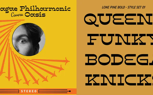
A reverse-contrast display slab with dramatic swashes, drawn by Amy Hood and inspired by the roadside towns along California's Route 395.
About
Designed by Amy Hood of Hoodzpah, Lone Pine draws from the desert towns and highways of the Eastern Sierra Nevada for its visual character. The typeface pairs extreme stroke contrast, inverted from the conventional axis, with generous swash details that make an immediate impression at large sizes. A style set toggles a more pronounced 1970s science-fiction feel, giving the family a second distinct personality.
Classification
Lone Pine is a high-contrast reverse contrast slab serif display typeface with pronounced swashes, designed explicitly for headline and display use rather than text setting.
Weights
RegularBold
Languages
Latin Extended
Tags
displayreverse-contrastslabswashdecorativeretrowestern70s