Molfetta
Fort Foundry · Jen Hood, Amy Hood
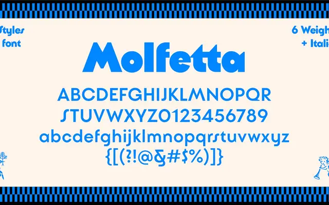
A deco-inflected geometric display sans from Hoodzpah, drawing on the chunky limestone architecture of the southern Italian port city of Molfetta.
About
Designed by Jen Hood and Amy Hood of Hoodzpah, the family runs across six weights from Light to Black with matching italics, plus a variable font. Its forms mix angled strokes with arched constructions and pronounced weight, giving it a sturdy, architectural quality suited to packaging, editorial headlines and food and hospitality branding. The extended Latin character set covers a broad range of languages.
Classification
Fort Foundry categorises Molfetta as a sans, but its deco-inflected geometry, heavy optical presence and explicit display orientation place it firmly in the display category with a geometric sans structure.