Santa Ana
Fort Foundry · Amy Hood
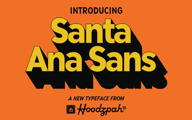
A semi-condensed geometric sans by Amy Hood, drawn from vintage storefront signage and marquee lettering across six weights with italics.
About
Inspired by the imperfect letterforms found on retro storefronts and marquees, Santa Ana blends a pseudo-geometric structure with deliberate personality. Its semi-condensed proportions make it efficient at text sizes while the six weights and matching italics give it range for headlines, logos and display work. The foundry recommends tracking it tight or wide, suggesting the design holds up across a variety of spacing choices.
Classification
Described as a semi-condensed pseudo geometric sans, drawing on vintage storefront signage with geometric influences but deliberately imperfect character forms.