Shackleton
Fort Foundry · Brian Brubaker, Mattox Shuler
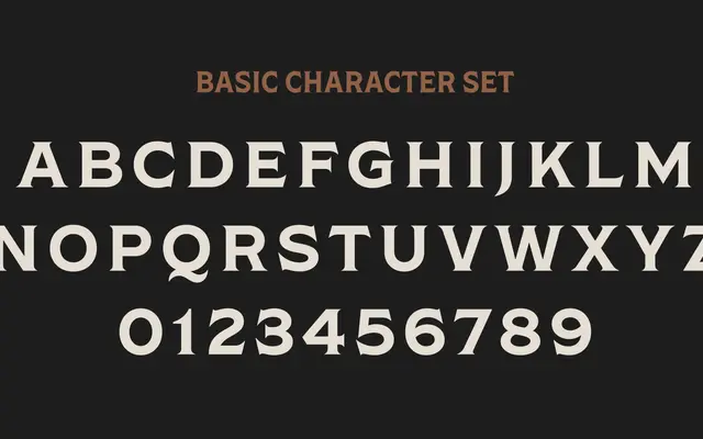
A flared serif family in four widths, designed by Brian Brubaker and Mattox Shuler and inspired by the Victorian-era aesthetic surrounding polar explorer Ernest Shackleton.
About
The family spans Condensed, Narrow, Regular and Wide, each with an italic, giving eight styles in total. Pronounced flared serifs carry the gilded quality of late Victorian lettering while the range of widths keeps it practical across headlines and display settings. Uppercase and lowercase alternates, ligatures and a broad Latin extended character set extend its usefulness beyond purely decorative work.
Classification
A serif with pronounced flared serifs drawing on Victorian typographic conventions. The width variants and historical reference place it firmly in the display serif tradition rather than a conventional text classification.