Silverberg
Fort Foundry · Mattox Shuler
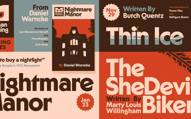
A geometric display sans with deliberate eccentricities drawn from 1970s typographic styles, pitched as Futura dressed up as Dracula.
About
Designed by Mattox Shuler and produced by Graeme Swank and Brian Brubaker, Silverberg takes the geometric skeleton of faces like Futura and layers in eccentric details inspired by 1970s typefaces such as ITC Serif Gothic and Cortez. The family is minimal in scope — just Bold and Bold Italic — making it a focused titling tool rather than a workhorse. Wide Latin Extended language support makes it practical for international display work despite its narrow weight range.
Classification
Silverberg is built on geometric sans foundations akin to Futura but with eccentric, decorative inflections drawn from 1970s typographic styles, making it function primarily as a display face rather than a neutral grotesque.