Tiller
Fort Foundry · Brian Brubaker, Mattox Shuler
seriftransitional serifitalic
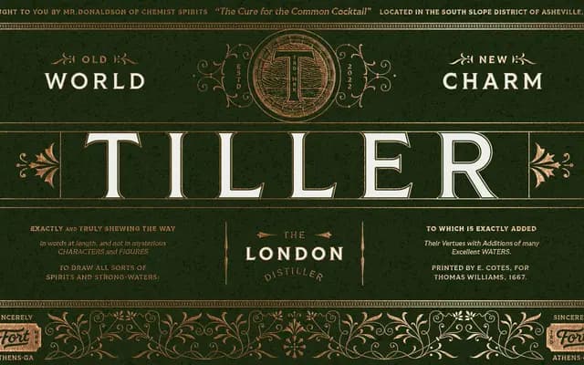
A workhorse serif family drawing on Romanesque typography and 19th-century ephemera, offered in five weights with matching italics.
About
Inspired by geometric forms and 19th-century printed ephemera, Tiller strikes a balance between historical warmth and practical function. Five weights run from Regular to Heavy, each with a Roman and Italic, totalling ten styles. The family covers more than 200 languages and includes OpenType features such as stylistic alternates and case-sensitive punctuation.
Classification
Tiller is a serif drawing on Romanesque typography and 19th-century ephemera, with geometric influences giving it a historical yet structured character suited to text and display use.
Weights
RegularMediumDemiBoldHeavy
Languages
Latin Extended
Tags
serifhistorical19th-centuryworkhorseeditorialgeometric-influencedmultilingual