Venice Blvd
Fort Foundry · Jen Hood, Amy Hood
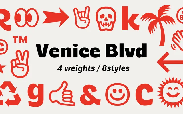
A cheerful display sans by Hoodzpah running four weights from Regular to Black, each with italics and a set of illustrative symbols.
About
Designed by Jen and Amy Hood of Hoodzpah, Venice Blvd covers eight styles across four weights with a deliberately light-hearted character that shifts from whimsical at Regular to heavy and expressive at Black. The family includes over 22 illustrative symbols and broad Latin extended coverage across a wide range of languages. Best suited to headlines, posters and branding work where personality takes priority over neutrality.
Classification
Categorised as a display sans by the foundry; its expressive weight range and illustrative character set make it unsuitable for body text, placing it firmly in the display category.