Hyperlegible Sans
sans-serifhumanist sans
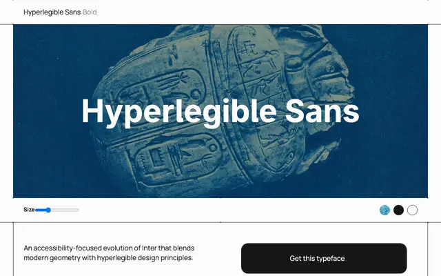
A humanist sans designed around maximum legibility, with letterforms engineered to reduce confusion between similar characters.
About
The typeface centres on letterform differentiation, making glyphs that are commonly mistaken for one another visually distinct. Currently available in a single Bold weight. Suited to signage, wayfinding, interfaces and any context where reading clarity takes priority over typographic personality.
Classification
Described as a humanist sans with accessibility and legibility as its central design goals, prioritising clear letterform differentiation over stylistic expression.
Weights
Bold
Languages
Latin
Tags
humanistlegibilityaccessibilitycleanfunctional