Cafeteria
Frere-Jones · Tobias Frere-Jones · 1992
sans-seriffreeform sans
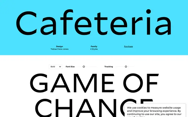
A freeform condensed sans drawn by Tobias Frere-Jones in 1992, inspired by the hand lettering of his friend Chris Vermaas, balancing visual activity with readability.
About
Begun as an experiment in rhythm and irregularity, Cafeteria avoids the stiffness typical of condensed sans serifs by introducing the organic variation found in hand lettering. Frere-Jones drew it with deliberate care to keep the liveliness from tipping into illegibility. Four weights from Light to Black make up the family, with no italics or condensed sub-cuts.
Classification
Described by the foundry as a freeform sans serif; condensed but irregular in rhythm, inspired by hand lettering rather than systematic geometric or grotesque conventions.
Weights
LightRegularBoldBlack
Languages
Latin
Tags
freeformhand-letteredcondensedirregulardisplayexpressivecasual