Cassis
Frere-Jones · Nina Stössinger
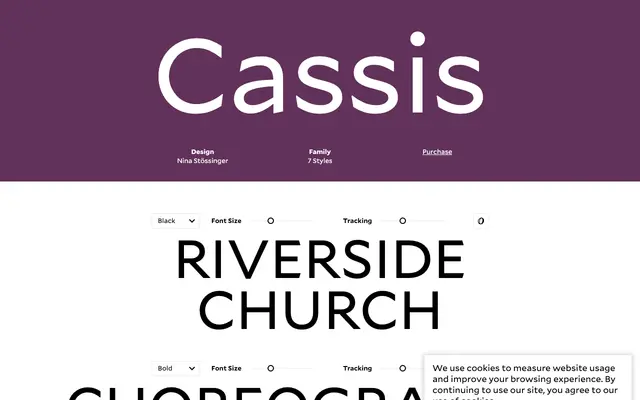
A geometric sansserif by Nina Stössinger drawn from midcentury Belgian, Swiss and American lettering traditions, offered in seven weights from Thin to Black.
About
Cassis draws on early- to mid-century lettering and signpainting from Belgium, Switzerland and the United States, using geometric structure as a starting point rather than a constraint. Swelling curves, reaching terminals and a deliberate imbalance of stroke weights give it a warmth and density that work particularly well at display sizes. Seven weights from Thin through Black make it suited to branding, identity and titling where a strong but approachable voice is needed.
Classification
Cassis is described as a geometric sansserif informed by midcentury lettering and signpainting, with geometric underpinnings tempered by humanist personality through swelling curves and reaching terminals.