Empirica
Frere-Jones · Tobias Frere-Jones, Nina Stössinger
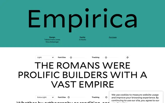
A sharp display serif by Tobias Frere-Jones and Nina Stössinger rooted in ancient Roman inscriptions and a 19th-century French revival of that tradition.
About
Originally commissioned for magazine headlines, Empirica takes its formal cues from Roman lapidary lettering and the work of French printer Louis Perrin, who reconstructed lost Lyon inscriptions in 1846. Close spacing and delicate serifs make it most at home in large sizes, where its six weights from Extra Light to Black give it a wide range from refined to forceful. Alternate short descenders allow tighter line spacing in headline settings, and an extensive set of OpenType features covers ligatures, oldstyle figures, fractions and contextual alternates.
Classification
Empirica draws on ancient Roman inscriptional lettering and 19th-century French revivals of that tradition, producing a sharp, high-contrast serif with close spacing suited to large display sizes.