Grand Central
Frere-Jones · Tobias Frere-Jones · 1994
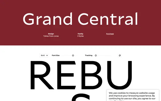
A two-weight serif drawn from the original sign lettering of Grand Central Terminal, commissioned for the 1994 renovation to maintain continuity with the station's 1913 Beaux-Arts lettering.
About
Tobias Frere-Jones studied decades of archive photography to reconstruct the Light from the original American French Oldstyle lettering painted throughout Grand Central Terminal when it opened in 1913. The Bold was drawn to the specifications of the Americans with Disabilities Act, which governs contrast ratios and legibility requirements for public signage. OpenType features include contextual alternates for tighter letterpair forms, long-tailed Q variants, titling umlauts and arrow ligatures.
Classification
Rooted in the French Oldstyle tradition initiated by Louis Perrin in 1846, the design is a Beaux-Arts revival drawn directly from the sign lettering of Grand Central Terminal, placing it firmly within humanist old-style serif territory with a distinctly American inflection.