Magnet
Frere-Jones · Inga Plönnigs
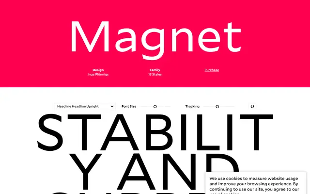
A two-part sans-serif family by Inga Plönnigs that pairs an ultra-compressed, theatrically tight Headline with a notch-detailed Standard built for dense text settings.
About
Designed by Inga Plönnigs with contributions from Nina Stössinger, Magnet splits into two distinct subfamilies: the Headline, offered in Upright, Slanted and Backslanted cuts, creates dense rhythmic patterns through extreme compression; the Standard runs across five weights from Light to Black with italics throughout, distinguished by deeply cut notches and boxy curves that suit tight leading and dense copy. The Headline's opposing slant directions give the family an unusual theatrical range rarely found in a single release. Both subfamilies share an underlying visual logic that makes them function together without feeling forced.
Classification
Magnet combines an ultra-compressed headline sans with a workhorse text-capable sans under one family name; the Headline's extreme compression and theatrical proportions place it firmly in the display sans territory, while Standard operates as a conventional text sans.