Nobel
Frere-Jones · Tobias Frere-Jones after Sjoerd Hendrik de Roos · 1929
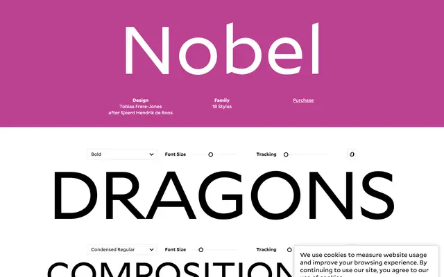
Tobias Frere-Jones's revival of de Roos's 1929 Dutch grotesque, balancing geometric rigour with an approachable, slightly imperfect warmth.
About
Originally an adaptation of Berthold Grotesk made at Typefoundry Amsterdam in 1929, Nobel steers between the bluntness of 19th-century grotesques and the cold precision of Futura. Frere-Jones encountered a specimen by chance in 1992 and described the result as 'Futura cooked in dirty pots and pans', capturing its geometry tempered by human irregularity. The revival spans 18 styles across six weights in normal and condensed widths, with italic cuts for the upright series and contributions to the Extra Light from Cyrus Highsmith and Dyana Weissman.
Classification
Nobel is a revival of Sjoerd Hendrik de Roos's 1929 adaptation of Berthold Grotesk, which tilted away from blunt 19th-century grotesques towards geometric severity, placing it between grotesque and geometric sans-serif traditions.