Retina
Frere-Jones · Tobias Frere-Jones
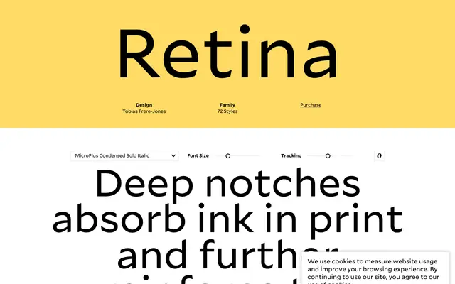
A 72-style sans-serif by Tobias Frere-Jones built for extreme small-size legibility in financial data displays and screen interfaces, with deep ink-trap notches that reinforce letterform clarity under ink spread or low resolution.
About
Originally commissioned for The Wall Street Journal's stock listings, Retina addresses the specific problem of type that must remain readable at very small sizes in print and on screen. Deep notches cut into stroke junctions absorb ink spread and sharpen letterform distinctions that would otherwise collapse. The family spans two optical subfamilies, Standard and MicroPlus, each available in regular, narrow and condensed widths across up to seven weights with matching italics.
Classification
Retina is a sans-serif designed for small-size legibility in financial data and screen interfaces, with humanist proportions and deep ink-trap notches that clarify letterforms under difficult rendering conditions.