Seaford
Frere-Jones · Tobias Frere-Jones, Nina Stössinger, Fred Shallcrass
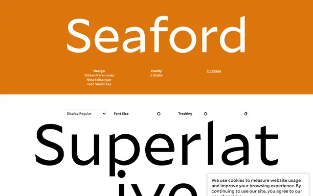
A text-focused humanist sans by Tobias Frere-Jones, Nina Stössinger and Fred Shallcrass, originally commissioned by Microsoft for Office 365, built around the rhythms of long-form serif typography.
About
Designed with gently asymmetric, organic letterforms that deliberately emphasise differences between individual letters, Seaford is intended to produce readable word shapes rather than pursue modernist uniformity. It comes in Standard and Display optical sizes, each with Regular and Bold weights plus italics, and offers four figure sets alongside OpenType alternates for differentiated or simplified forms. One of five new sans-serifs bundled with Office 365 subscriptions.
Classification
Seaford is described as rooted in long-form text serifs, with organic, gently asymmetric letterforms that resist modernist homogenisation — hallmarks of humanist sans design intended to aid legibility in extended reading.