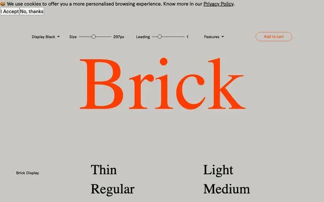
A serif family from Fuerte Type split into Display and Text optical cuts, each running across five weights from Thin to Black, with a distinctly British pub and brewing sensibility in its specimen copy.
About
Brick divides into two purpose-built subfamilies: Brick Display for large-scale setting and Brick Text for smaller, continuous reading, each sharing five weights from Thin to Black. The specimen leans heavily on East London pub culture, brewery history and Sunday roast copy, giving the family a clear sense of its intended territory. An extensive OpenType feature set covers small caps, old-style figures, historical forms, ornaments and thirteen stylistic sets, offering considerable flexibility for editorial and identity work.
Classification
Brick is presented in distinct Display and Text optical subfamilies, suggesting a high-contrast serif with editorial and display applications in mind, consistent with a contemporary display serif classification.