Thesaurus
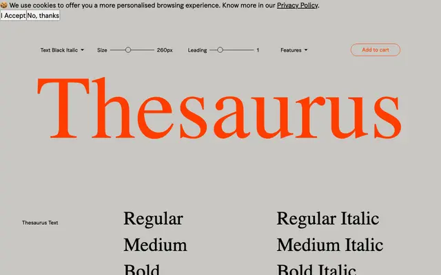
A two-subfamily serif family from Fuerte Type, split into Text and Display optical cuts across four weights with extensive OpenType features including historical forms, swashes and old-style figures.
About
Spanning eight styles each in Text and Display subfamilies, this family is built for the full range of typographic scale from continuous reading to large-scale headlines. The feature set is notably thorough, covering historical forms, historical ligatures, swashes, small caps, ornaments and multiple figure styles. The classical sensibility of the letterforms, particularly evident in the Display italics, suggests a typeface well suited to editorial, cultural and literary publishing work.
Classification
The family's two optical subfamilies — Text and Display — alongside its historical forms, swashes and old-style figures point to a classical serif tradition rooted in transitional or early modern letterforms, with the Display cuts showing the contrast and refinement typical of that lineage.