Accent Graphic
G-Type · Nick Cooke · 1997
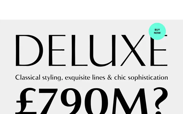
A flared sans with serif-like thick/thin contrast, originally drawn in 1997 as a corporate typeface for a London design consultancy.
About
Designed by Nick Cooke and originating from a client commission, Accent Graphic applies the optical contrast of a serif to a sans skeleton, with flared stems lending it a delicate, refined quality. The family runs to three weights — Light, Medium and Bold — in OpenType format with coverage for Western, Central and Eastern European languages. Its understated elegance has seen it used by luxury brands, including Salvatore Ferragamo for their Signorina fragrance line.
Classification
Accent Graphic is described as a sans typeface with the thick/thin contrast of a serif, with flared stems — placing it in the tradition of flared or stressed sans typefaces, distinct from pure geometric or grotesque forms.