Precious Sans Two
G-Type · Nick Cooke
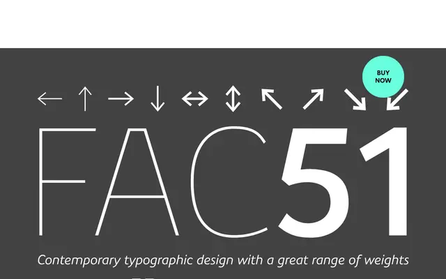
A thorough reworking of Nick Cooke's original Precious Sans, with nearly every character redrawn and the family extended with small caps, discretionary ligatures and directional arrows across six weights.
About
G-Type's Nick Cooke rebuilt Precious Sans from the ground up, redrawing and reproporting almost every glyph rather than issuing a minor update. The quirky originals, including the extended lowercase 'f' and binocular 'g', survive as stylistic alternates via OpenType style sets, preserving the character of the first release without forcing it on users. Twelve styles cover Thin to Black with italics, and the feature set runs to small caps, proportional and tabular figures, fractions, superiors and 20 directional arrows per weight.
Classification
A contemporary sans-serif with humanist tendencies, featuring quirky alternate forms retained as stylistic sets and a refined balance between personality and utility across six weights.