Saltaire
G-Type · Nick Cooke
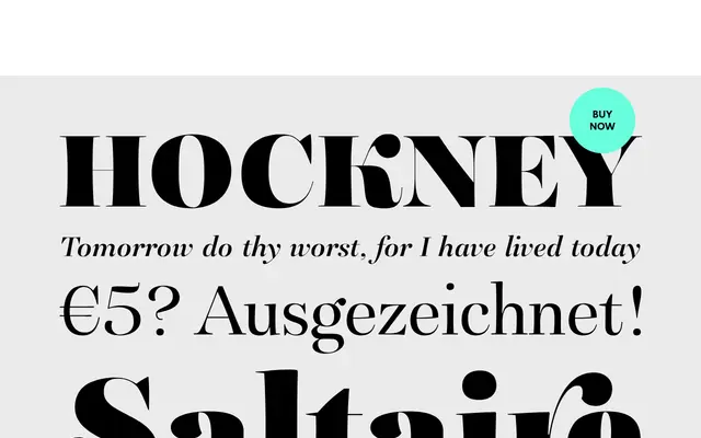
A Didone serif by Nick Cooke with deliberately 'lumpy' tapered stems and swash characters, designed to bring more personality to a genre that can feel predictable.
About
Nick Cooke designed Saltaire to retain the extreme thick-to-thin contrast of the Didone tradition while adding character through slightly irregular, tapered stems across a range of fourteen styles from Light to Black. Super-contrasted Poster and Poster Italic cuts extend the family for headlines and fashion editorial where maximum impact is needed. Each style ships with small caps, stylistic alternates, swash glyphs and multiple figure options via OpenType features.
Classification
Saltaire is explicitly a Didone typeface, characterised by extreme thick-to-thin stroke contrast in the tradition of Didot and Bodoni, with tapered stems and super-contrasted Poster styles reinforcing that classification.