Sherborne
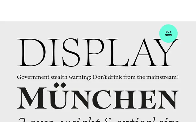
A humanist old style serif with optically tuned subfamilies, notable for its 'waisted' vertical stems that curve inward for added elegance.
About
Sherborne draws on calligraphic tradition through tapered stems, angled axes and bracketed serifs, with a modern refinement introduced via concave vertical stems said to have been inspired by a letter from Eric Gill to Stanley Morison. Three subfamilies — Display, Headline and Text — each contain five weights from Thin to Bold with italics, giving 30 fonts in total. The subfamilies are differentiated by x-height, serif length and contrast, with Display offering the finest proportions and Text the most practical weight for reading sizes.
Classification
The foundry explicitly describes Sherborne as a Humanist Old Style serif, citing calligraphic roots, tapered stems, angled axes and bracketed serifs — characteristics that define the humanist serif tradition.