Victory
G-Type · Nick Cooke
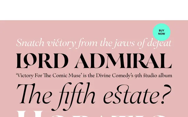
A classical serif by Nick Cooke drawn from the lettering on the stern of HMS Victory, offered in both text and high-contrast display variants across ten styles each.
About
Inspired by the carved stern lettering of the 104-gun warship HMS Victory, Nick Cooke's design pairs standard text weights with higher-contrast display cuts, running from ExtraLight to ExtraBold in each subfamily. The complete volume bundles variable font files for both upright and italic styles, with axes for weight and optical size in a single file. Each style includes small caps, multiple figure sets and an extended character set with alternates and ligatures covering West European, Central and Eastern European, Baltic and Turkish scripts.
Classification
Designed with reference to historical ship lettering, Victory exhibits classical serif proportions with high-contrast display variants alongside text-optimised weights, placing it firmly in the classical or traditional serif category.