Chapter
Good Type Foundry · 2017
serifdisplay serif
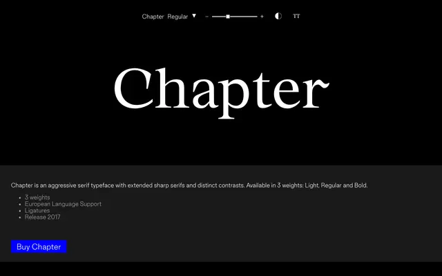
A high-contrast display serif with sharp, extended serifs across three weights, released in 2017.
About
A display serif built around aggressive contrast and elongated sharp serifs that give it an edgy, editorial character. Available in Light, Regular and Bold, the family covers European language support and includes ligatures, making it usable across a range of Latin-based typesetting. A compact but purposeful release suited to headlines and branding work that needs weight and edge.
Classification
Described as aggressive with extended sharp serifs and distinct stroke contrast, placing it firmly in the display serif category where dramatic, high-contrast letterforms are the primary intent.
Weights
LightRegularBold
Languages
Latin Extended
Tags
serifdisplayhigh-contrastsharp-serifsaggressiveeditorialeuropean