Good Mono
Good Type Foundry · 2020
monomonospaced grotesquemono
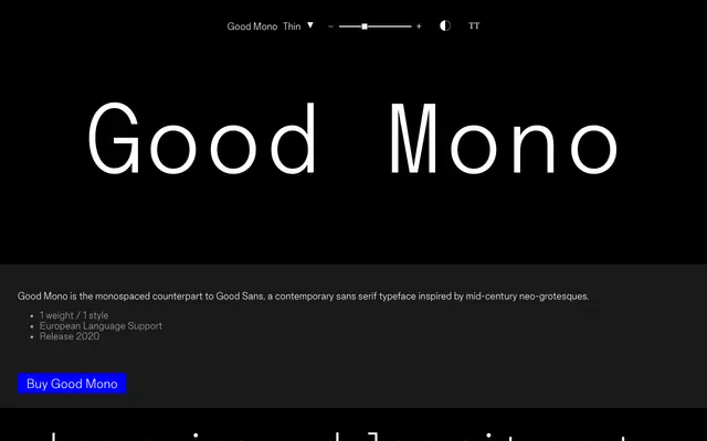
A monospaced companion to Good Sans, drawing on mid-century neo-grotesque forms and released in a single weight.
About
Designed as the fixed-width counterpart to Good Sans, Good Mono applies the proportions and spirit of mid-century neo-grotesques to a monospaced grid. It ships in one weight with broad European language support, covering accented Latin characters across 172 glyphs. The restrained single-style offering suits coding environments, data display or editorial contexts where a clean, unfussy mono is needed.
Classification
A monospaced companion to Good Sans, itself a neo-grotesque; the fixed-width format and grotesque forms place it firmly in the monospaced grotesque subcategory.
Weights
Thin
Languages
Latin Extended
Tags
monospacedgrotesqueneo-grotesquecompanioncodingminimaleuropean